基于Element-Ui的“Slider滑块”组件封装一个前端滑动滑动验证组件
- 主要用于登录验证
- 纯前端验证(滑着过瘾)目前无法与后端进行校验
- 封装还可以优化
- 直接看代码吧
slider组件
// slider/index.vue'
<template>
  <div class="bar" ref="bar">
    <el-slider
      class="slider"
      ref="slider"
      v-model="value"
      :show-tooltip="false"
      @change="sliderChange"
      :disabled="sliderDisabled"
    ></el-slider>
    <div class="slider-text-before" ref="barText">
      <div :class="noReset?'run run-no-slider':'run'" v-if="!isSuccess">拖动滑块验证</div>
      <span v-else style="color:#fff;">验证通过</span>
    </div>
  </div>
</template>
<script>
export default {
  name: "slider",
  props: {
    reset: {
      type: Boolean,
      default: false
    },
    noReset: {
      type: Boolean,
      default: false,
    }
  },
  data() {
    return {
      value: 0,
      isSuccess: false,
      sliderDisabled: false
    };
  },
  watch: {
    reset: function(val) {
      if (val) {
        this.sliderReset();
      }
    },
    noReset(val){
      if(val){
        this.$refs.bar.classList.add("no-slider")
      }else{
        this.$refs.bar.classList.remove("no-slider")
      }
    },
    value(val){
      this.$emit("value",val)
    }
  },
  created() {
    },
  mounted() {
    console.log(this.$refs.slider.$refs.button1.$refs.button)


    // this.$refs.slider.$refs.button1.$refs.button.style = ""
    this.$refs.slider.$refs.button1.$refs.button.lastChild.innerHTML =
      "<i class='el-icon-d-arrow-right icon-arrow-right'></i>";

  },
  methods: {
    sliderChange(val) {
      if (val === 100) {
        this.sliderSucceed();
      } else {
        this.sliderReset();
      }
    },
    sliderSucceed() {
      this.isSuccess = true;
      this.$refs.slider.$refs.button1.$refs.button.lastChild.innerHTML =
        "<i class='el-icon-success icon-success'></i>";
      this.sliderDisabled = true;
      this.$emit("success", true);
    },
    sliderReset() {
      this.isSuccess = false;
      this.value = 0;
      this.sliderDisabled = false;
      this.$emit("update:reset", false);
      this.$refs.slider.$refs.button1.$refs.button.lastChild.innerHTML =
        "<i class='el-icon-d-arrow-right icon-arrow-right'></i>";
    }
  }
};
</script>
<style lang="scss" scoped>
$color: #67c23a;
// $color: #409EFF;
$slider_button_width: 60px;
$slider_button_height: 40px;
.bar {
  position: relative;
  width: 100%;
  background-color: #e4e7ed;
  border-radius: 3px;
  .slider-text-before {
    position: absolute;
    left: 50%;
    top: 50%;
    transform: translate(-50%, -50%);
    font-size: 16px;
    letter-spacing: 2px;
    user-select: none;
    .run {
      padding: 0 30px;
      color: transparent;
      -moz-user-select: none;
      -webkit-user-select: none;
      user-select: none;
      -o-user-select: none;
      -ms-user-select: none;
      background: -webkit-gradient(
        linear,
        left top,
        right top,
        color-stop(0, #333),
        color-stop(0.3, #333),
        color-stop(0.5, #fff),
        color-stop(0.7, #333),
        color-stop(1, #333)
      );
      -webkit-background-clip: text;
      -webkit-text-fill-color: transparent;
      -webkit-text-size-adjust: none;
      -webkit-animation: slidetounlock 3s infinite;
      animation: slidetounlock 3s infinite;
    }
    .run-no-slider{
      background: -webkit-gradient(
        linear,
        left top,
        right top,
        color-stop(0, #F56C6C),
        color-stop(0.3, #F56C6C),
        color-stop(0.5, #fff),
        color-stop(0.7, #F56C6C),
        color-stop(1, #F56C6C)
      );
      -webkit-background-clip: text;
      -webkit-text-fill-color: transparent;
      -webkit-text-size-adjust: none;
      -webkit-animation: slidetounlock 3s infinite;
      animation: slidetounlock 3s infinite;
    }
  }
  .slider-text-after {
    position: absolute;
    left: 50%;
    top: 50%;
    transform: translate(-50%, -50%);
    z-index: 10;
    color: #fff;
  }
  .slider {
    width: calc(100% - #{$slider_button_width});
    /deep/.el-slider__runway {
      margin: 0;
    }
    /deep/.el-slider__bar {
      height: 40px;
      background-color: $color;
      border-top-left-radius: 0px;
      border-bottom-left-radius: 0px;
    }
    /deep/.el-slider__runway {
      height: 40px;
    }
    /deep/.el-slider__button-wrapper {
      top: 0;
      width: $slider_button_width;
      height: 40px;
      margin-left: ($slider_button_width/2);
      :hover {
        transform: none;
      }
    }
    /deep/.el-slider__button {
      width: $slider_button_width;
      height: 40px;
      border-radius: 0;
      border-color: #dcdfe6;
      :hover {
        transform: none;
      }
    }
    /deep/.el-slider__button.dragging,
    .el-slider__button.hover,
    .el-slider__button:hover {
      -webkit-transform: none !important;
      transform: none !important;
    }
    /deep/.el-slider__runway.disabled .el-slider__button:hover {
      cursor: grab !important;
    }
    /deep/.icon-arrow-right {
      line-height: ($slider_button_height - 4px);
      font-size: 18px;
      color: #4c4c4c;
    }
    /deep/.icon-success {
      line-height: ($slider_button_height - 4px);
      font-size: 20px;
      color: $color;
    }
  }
}
@-webkit-keyframes slidetounlock {
  from {
    background-position: -70px 100%;
  }
  to {
    background-position: 80px 0;
  }
}
.no-slider{
  animation: shake 800ms ease-in-out;
}

@keyframes shake {
    10%, 90% { transform: translate3d(-1px, 0, 0); }
    20%, 80% { transform: translate3d(+2px, 0, 0); }
    30%, 70% { transform: translate3d(-4px, 0, 0); }
    40%, 60% { transform: translate3d(+4px, 0, 0); }
    50% { transform: translate3d(-4px, 0, 0); }
}
</style>
使用
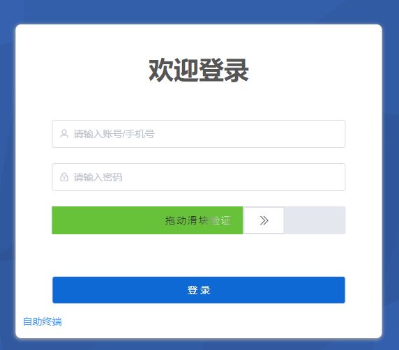
效果截图// 引入 import slider from './slider' // 使用 <slider v-bind:reset.sync="isResetSlider" :noReset="isNoReset" @value="sliderValue" @success="sliderSuccess"></slider> components:{ slider }, data() { return { isResetSlider: false, isSeccess: false, sliderVal: "", isNoReset: false }; } methods: { // 滑动验证 sliderSuccess(val){ this.isSeccess = val }, sliderValue(val){ this.sliderVal = val }, submitForm() { if(this.sliderVal == 0){ this.isNoReset = true setTimeout(() => { this.isNoReset = false }, 900); return } if(this.isSeccess){ console.log("submit"); this.isResetSlider = true this.isSeccess = false }else{ console.log("请滑动滑块验证"); } } } - 滑动验证-未滑动
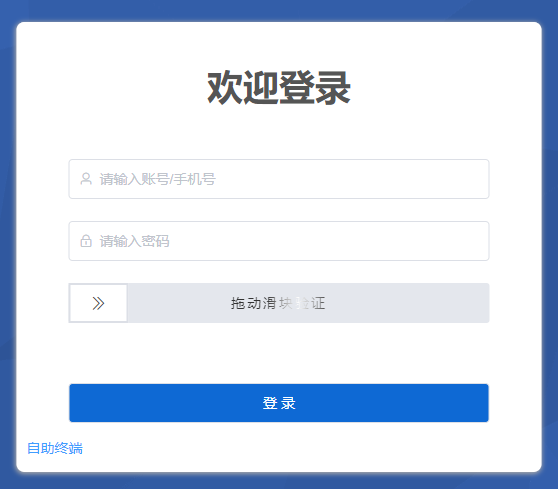
滑动验证-未滑动
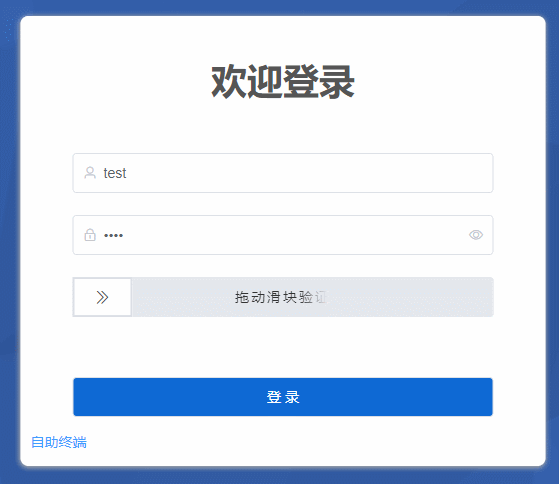
- 滑动验证-滑动中
滑动验证-滑动中
- 滑动验证-滑动成功
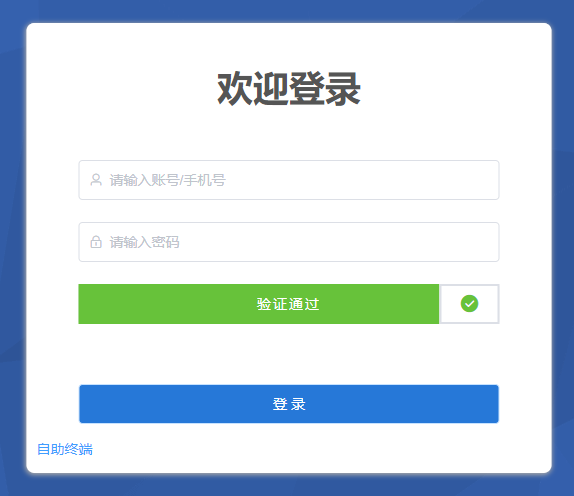
滑动验证-滑动成功
- 滑动验证GIF
滑动验证GIF